March 31, 2024
|
Mobile Design
UX
UI
6 min read
5 Weeks
1 Designer
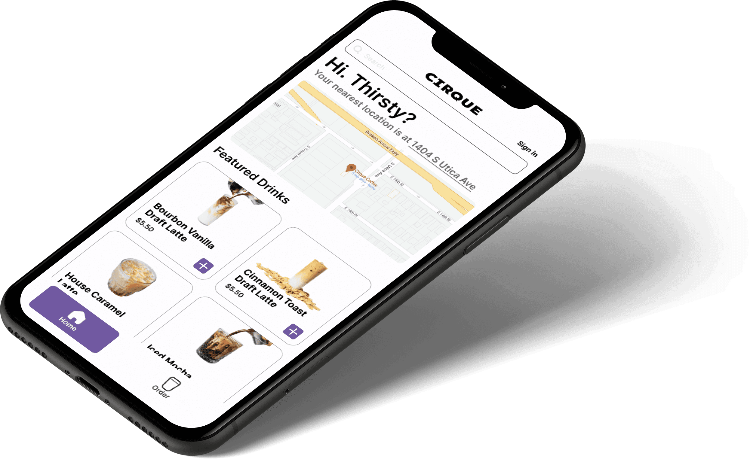
Cirque Coffee is a local specialty coffee chain based in Tulsa, Oklahoma.
As the company expanded with two new drive-thru locations, I noticed friction in their app—particularly for first-time users. As part of a personal case study, I proactively redesigned the app to align with their new location model, offering a potential solution even before the company requested one.
The Problem
The mobile ordering process was confusing for first-time users, leading to longer checkout times.

The Solution
A streamlined checkout process in a redesigned app, optimized for first-time users to ensure an efficient experience.
Constraints
Guest Checkout - Enable users to quickly complete their purchase without requiring an account, catering to users who are on-the-go and want a fast experience.
Instant Product Visibility - Display products immediately upon entering the app to minimize friction and increase potential sales.
Payment Integration - Implement Apple and Google Pay for faster checkout and streamlined user info.
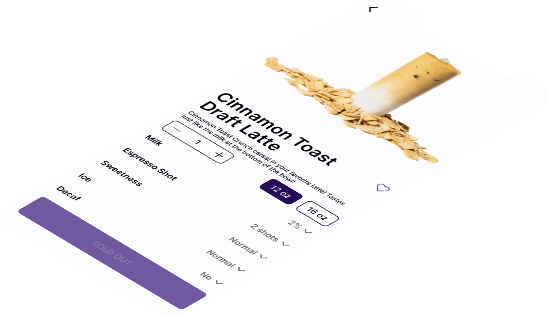
Editable Customization - Pre-fill custom drink options with the ability for users to edit their choices.
How I Solved It
The biggest challenge was removing any unnecessary steps to get users to their coffee quickly. I focused on simplifying the process: download the app, pick a drink, add it to the cart, fill in minimal info, and check out with Apple or Google Pay—all without the need for an account upfront. No need for an account upfront, but if they loved the coffee and wanted to come back, they could create one later.
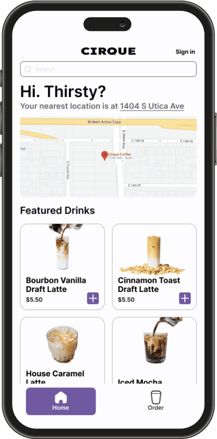


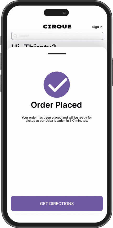
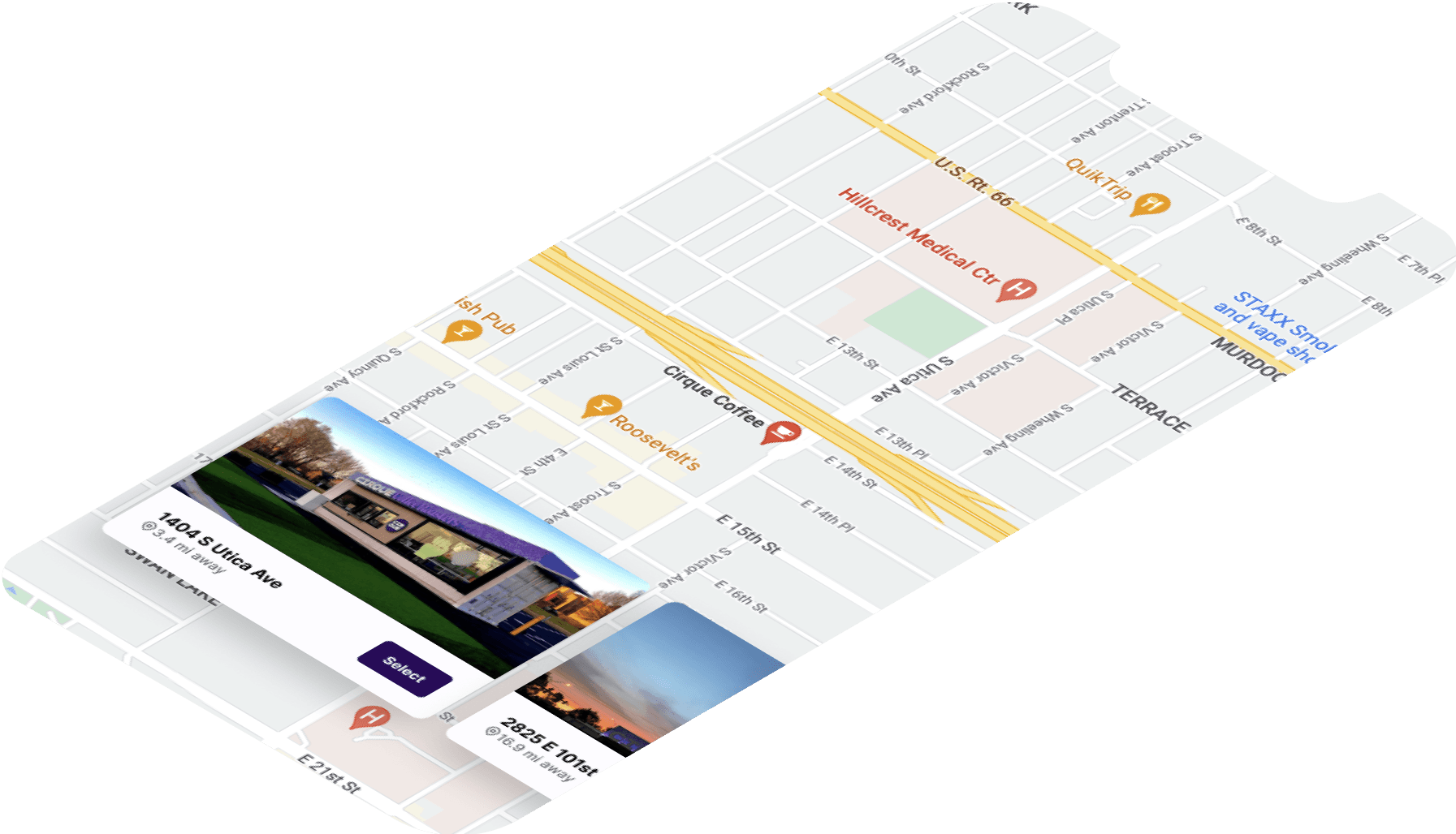
Guest Checkout
The guest checkout experience was streamlined for speed and simplicity. Depending on the device, users could check out with Apple or Google Pay in just three taps. For those not using fast checkout, creating a profile was optional. Designed with on-the-go customers in mind, especially those driving by the highway location, users could quickly place an order, customize it if needed, or create an account if they had more time.


Impact
Outcomes
In usability tests with 16 users, 81% were confident they could complete an order in under 5 minutes, while the remaining 19% estimated it would take them up to 8 minutes. This significant improvement in speed showed that the new flows were highly efficient and intuitive for first-time users. In the open feedback section, users provided the following praise:
“I particularly like how the checkout process brought up pop up windows that closed once they were done, which made it feel like the entire checkout happened from the same screen.” - Maze User
“I liked that the components of the checkout screen brought you back to a central environment. The design feels well thought out and efficient!” - Maze User
“For the quick options, I would also suggest allowing a user to search for other drinks that they might typically buy.” - Maze User
Retrospective
Users responded positively to the updated interface, especially the cleaner, more modern look. Some asked for greater customization, which I added to our backlog for future iterations. Feedback around oversized components led me to quickly refine layouts for better responsiveness. Shortly after launch, we signed IPC—one of our largest clients—driven in part by the strength of the design work and our upcoming compliance release.